Back to Builds
Case Study · Civic Mapping
Visit the live site

Four interactive maps. Zero API keys.

A Wisconsin conservation coalition needed to out-map a billion-dollar developer — defensibly, on a volunteer budget. So we built the whole campaign site around four map systems fed by public GIS data, rendered with open-source tools and no licensing fees.

4
Map systems
9
Public data sources
$0
Map licensing
19 days
Commit to launch

The other side already had a map.

The developers of a proposed 765,000-volt transmission line published a slick corridor map: a clean set of thin lines across 140 miles of southwest Wisconsin's Driftless region. On their map, it looks like nothing — a route, drawn neatly, headed somewhere else.

The coalition's whole argument is what those lines cross: cold-water trout streams, karst bedrock riddled with sinkholes, federally protected habitat, and thousands of acres of family farmland. You can't win that argument with a paragraph. You have to let people see it — and every claim on the map has to survive hostile review, because opposing counsel reads every page.

So the site couldn't be "a line on a map." It had to be a small civic-intelligence platform: multiple map views, each doing a different job, every layer traceable to a public source. And it had to ship fast, on a nonprofit's budget, with no monthly bill hanging off a mapping vendor.

Organization
No 765 Line, Inc. — Wisconsin 501(c)(3) conservation nonprofit
Scope
Full campaign website · design, build, content, and four interactive map systems
Platform
WordPress + Bricks · MapLibre GL · static GeoJSON
Timeline
First commit to live launch in 19 days; maps and data added across the following weeks
Full disclosure: this isn't an arm's-length client engagement. Rise Above founder Michael Browne serves as the coalition's Secretary/Treasurer and media lead and built the site as a volunteer. That's the honest framing — and the reason it's a fair portfolio piece: it was built under real constraints most demos never face. Legal-sensitivity review, subject-matter fact-checking, a zero-dollar tooling budget, and a "would this survive a deposition?" test on every published claim.

One corridor, four ways to see it.

A single "here's the route" map would have been a missed opportunity. Instead the corridor is split into four map systems, each placed where it does the most good — orient a first-time visitor, walk them through the stakes, help a landowner check their own address, and document the living systems in the path. All four share one rendering engine and one set of data files; only the framing changes.
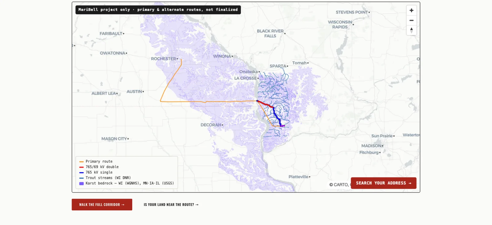
01 The homepage overview map showing the proposed corridor in orange, red and blue against purple karst bedrock and blue trout streams across the Driftless region, with a Search Your Address button.

The overview map

Homepage · orient & alarm

High on the homepage, full-bleed, interactive — not a button. In one glance you see the proposed corridor laid over the karst and trout-stream layers, so the argument lands before anyone reads a word. Two calls to action lead deeper: walk the full corridor, or check your own land.

Under the hood

A lazy-loaded <iframe> holding a standalone MapLibre page, reused verbatim from the same map component that appears on other pages. Layers load as static GeoJSON from the site root; the basemap is CARTO Positron with no key. Because it's an iframe, the heavy WebGL map never blocks the homepage's first paint.
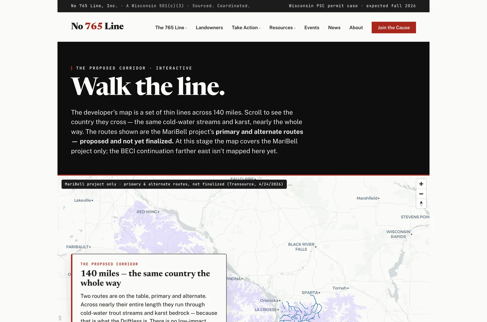
02 The Walk the Line storyscroll: a dark editorial header reading 'Walk the line' above a pinned map with a floating narrative card titled '140 miles — the same country the whole way.'

The corridor storyscroll

Dedicated page · walk the stakes

"Walk the line." The map pins to the screen and, as you scroll, flies segment by segment down the corridor while narrative cards name a real place, a sourced impact, and who it affects. It turns 140 abstract miles into a guided tour — the immersive counter-argument to the developer's tidy line.

Under the hood

An IntersectionObserver watches the narrative cards; as each scrolls into the middle band of the viewport it fires map.flyTo() to that segment's center and zoom. No scroll library, no framework — a few dozen lines of vanilla JavaScript over the MapLibre instance. The scroll narrative doubles as the accessible text fallback for anyone the WebGL map doesn't reach.
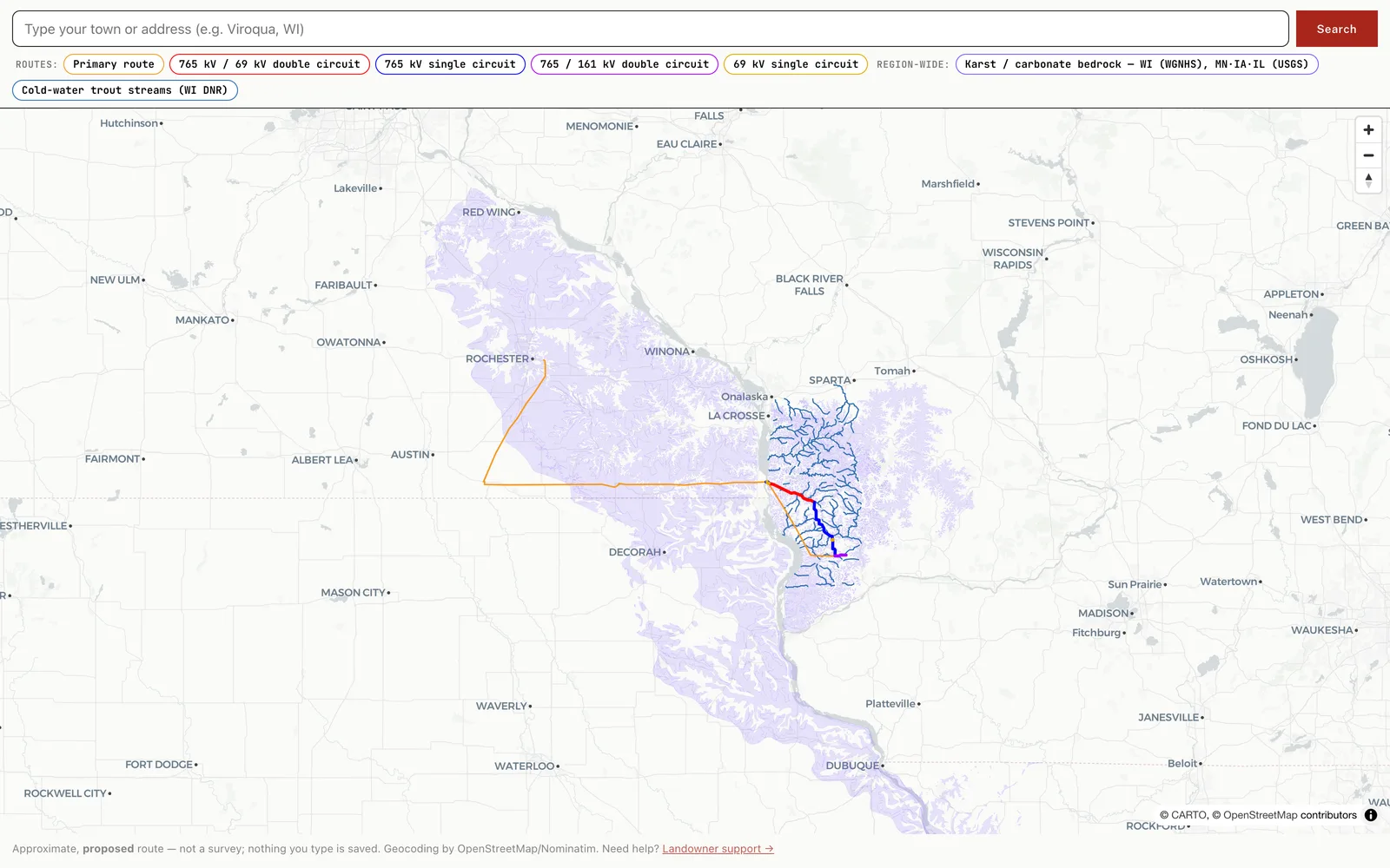
03 The landowner explore tool with a 'Type your town or address' search bar, colored route-toggle chips for each line configuration, and the corridor over karst and trout layers.

The address-search explore tool

Landowners page · make it personal

A landowner's first question is "is my land near this?" This tool answers it: type a town or address, the map flies there and drops a pin, and toggle chips let you switch route configurations and impact layers on and off. It's the conversion engine — the moment a worried neighbor becomes an engaged one.

Under the hood

Geocoding runs entirely client-side against OpenStreetMap's free Nominatim service — nothing the visitor types is ever sent to us or stored. That's a deliberate privacy and legal-lane choice: the only path that captures data is the separate landowner-support form. Honest framing is baked into the UI: "approximate, proposed route — for orientation only."
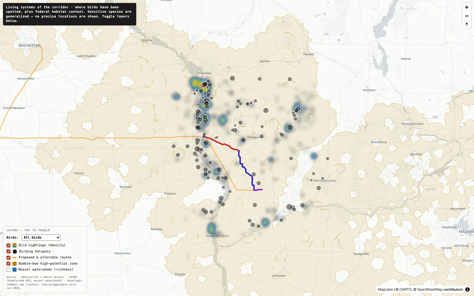
04 The living systems species map showing a rainbow heat-density layer of bird observations, dark hotspot dots, the corridor routes, a bumble-bee zone and a species selector dropdown set to 'All birds.'

The living-systems map

Resource page · document the path

The corridor doesn't just cross land — it crosses a flyway. This map layers thousands of research-grade bird observations as a heat surface, public birding hotspots, a federal bumble-bee zone, and mussel-rich watersheds, with a dropdown to isolate a single species. It's the ecological record, built to hand to regulators.

Under the hood

Bird points are binned to a ~2 km grid — counts only, no precise coordinates — so sensitive species (a threatened warbler, say) can never be located by someone with bad intent. A match expression recolors route layers by voltage config; the species dropdown swaps the density source between an all-birds layer and a per-species one. Currently in final integration, published to a preview URL.

The maps are only as good as the data behind them.

Every layer on every map comes from a named public source and was processed into a web-light file small enough to load instantly in a browser. Nothing is hand-drawn to make a point; nothing is unsourced. This is the part that lets the campaign stand behind the maps in a regulatory hearing — the receipts are baked in.

LayerWhat it showsPublic sourceHow it was pulled
Proposed routeThe corridor and its alternate line configurationsDeveloper public comment map (KML)Digitized from the developers' own filing; labeled "proposed, not final"
Karst bedrockSinkhole-prone carbonate rock under the corridorUSGS OFR 2014-1156 · WGNHSQueried from an ArcGIS FeatureServer, clipped, simplified, dissolved
Trout streamsCold-water Class I/II streams the line crossesWisconsin DNR hydrographyPublic DNR GIS layer, filtered to the corridor region
Bird densityWhere birds have actually been recordediNaturalist (research-grade)API pull, binned to a ~2 km grid — counts only
Birding hotspotsPublic birding locations near the corridoreBirdPublic hotspot list within ~45 km of the route
Bumble-bee zoneFederal high-potential zone for an endangered beeU.S. Fish & Wildlife ServiceCoarse federal polygon — inherently safe to publish
Mussel watershedsRivers with protected freshwater musselsUSFWS Midwest mussel dataWatershed-scale choropleth by species richness

One layer, start to finish: the karst

The karst layer is the clearest example of the pipeline. The raw national dataset is enormous and far too heavy for a web map. Getting it browser-ready without distorting the science took a four-step transform — and the result loads in well under a second.

For Wisconsin we used the finer state geological survey (WGNHS); for the neighboring states, the national USGS layer — composited into one file so the cross-border story stays intact.

4,662raw carbonate polygons pulled from the USGS layer (~17.8 MB)
clipcropped to the Driftless bounding box & simplified for the web
dissolvemerged slivers by rock & karst type into coherent shapes
~1.4 MBa few dozen shipped features — instant to load
Under the hood

The whole transform is one ogr2ogr (GDAL) pass plus a dissolve: -clipsrc to the Driftless envelope, -simplify 0.004 for web-light geometry, coordinates trimmed to five decimals, then a SQLite ST_Union grouped by state + karst type + rock type. The FeatureServer caps results at 2,000 rows, so the pull is paged in three requests. Every step is scripted and re-runnable, and each layer ships with a provenance note recording the source URL, access date, and caveats — so any number on the map can be traced back to its origin.

Defensibility is a process, not a claim

Caught in review · geography

The karst that swallowed Iowa

The first karst pull rendered a purple blob covering up to a third of Iowa — technically the carbonate footprint, but wildly off-message and misleading for a Driftless campaign. We re-clipped every layer to the EPA's official "Driftless Area" ecoregion boundary, dropping Iowa's coverage to under 3%. The cross-border story survived; the exaggeration didn't.

Caught in review · imagery

The tower that wasn't 765 kV

A candidate hero photo captioned as a 765 kV line turned out — on inspection of its own source — to be a 500 kV rebuild with shorter towers. An outside reviewer flagged it; we pulled it before launch. From then on every photo had to verifiably show what its caption claimed. A wrong image fails the deposition test even when the words are perfect.

Why each piece of the stack.

Every tool here was chosen for a reason a nonprofit board would recognize: no lock-in, no surprise bills, and something a volunteer can still run after the build is done. The map stack in particular is deliberately vendor-neutral — a decision that pays off every single month.

MapLibre GL JS

Map engine

The open-source WebGL map renderer — smooth vector maps, zero cost, no account.

Why: No API key, no per-load billing, no vendor that can change terms or pull the rug. The same engine already runs on our other builds, so the team knows it cold.

CARTO Positron

Basemap

A light, near-grayscale street basemap served from a public CDN — no key required.

Why: A muted base means the red route and colored impact layers are the visual. The map reads as the campaign's own, not a generic Google tile.

Static GeoJSON

Data layer

Every map layer is a plain file served from the site root — no database, no map server.

Why: Nothing to run, nothing to hack, cached at the edge for instant loads, and every file is human-readable and auditable. Simplicity is a security feature.

OSM / Nominatim

Geocoding

OpenStreetMap's free address search, called directly from the visitor's browser.

Why: Free, and private by design — a landowner's address never touches our servers. That keeps the public map and the private support form in strictly separate lanes.

WordPress + Bricks

CMS & builder

The live system of record, on affordable shared hosting the org already understood.

Why: A volunteer can publish a news post or update the tracker without a developer. The maps drop in as reusable embeds, so the CMS never has to "know" about WebGL.

Best-of-breed services

Conversion & ops

Givebutter donations, MailerLite email, Gravity Forms intake, Plausible analytics, The Events Calendar.

Why: Each is best-in-class for one job, privacy-respecting, and low- or no-cost — chosen so the whole thing runs on a nonprofit budget with no single point of lock-in.

A real platform, on a volunteer budget.

4
Interactive map systems
9
Public data sources
$0
Monthly map licensing
19 days
Commit to live launch

Built to survive hostile review

Every layer traces to a named public source; every published claim carries a visible citation and passed a "would this survive a deposition?" test. The maps aren't just persuasive — they're evidence-grade, ready to hand to state regulators.

The same craft, aimed at your goal

This was a conservation campaign, but the pattern is portable: public or proprietary data turned into fast, interactive maps that make a case a visitor can feel — for a tourism org, a chamber, a DMO, or any business whose story lives on a map.

Have a story that lives on a map?

Whether it's a region, a route, or a set of locations — I build interactive maps that turn data into something people can see and act on.